Morgan Norman
We created ProsperWorks with a clear vision in mind: make CRM useful again.
In today's world, relationships happen everywhere, all the time. Sellers play a key role in building those relationships but so do marketers, engineers, support reps, product managers, and even designers. To build lasting relationships, we communicate through email, live chat and meetings, and collaborate in Google Docs, Sheets, and Slides. Traditional CRM wasn't built for this world, and it can't keep up.
ProsperWorks was built to be intuitive and easy for everyone—not just sales teams—to use. Instead of keeping customer information locked away in a separate tool, it's available directly in the productivity tools that we use all day, every day: Gmail, Calendar, Hangouts, and Drive. There's no more data entry—information is collected from dozens of sources and automatically kept up-to-date.
Since those early days, we've grown a lot. With 15,000 customers from all over the world, we like to think we've done a pretty epic job of making CRM useful again. Now, we've outgrown the ProsperWorks brand. It's time for a change.
A fresh perspective on CRM—or as we see it, crm
ProsperWorks has become Copper and with it, we've launched a new brand that’s built around a clear vision:
The crm that works for you, so you can spend time on relationships instead of data entry.
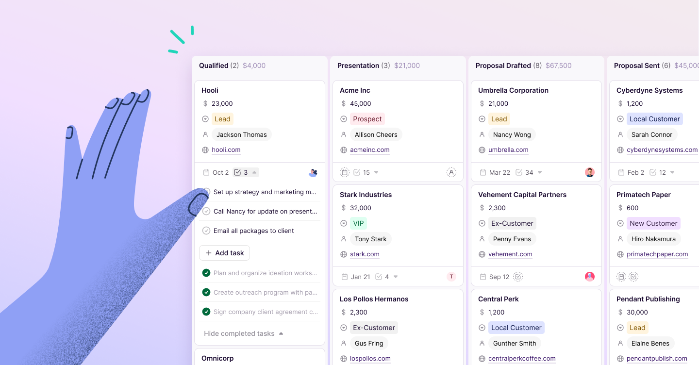
The old CRM industry is tired and dated, and we saw an opportunity to reinvigorate millions of relationships. We wanted to change the way our company interacts with the world but more than that, we wanted to change how people interact with CRM.
With our new brand, we will:
- Inject energy into CRM. Our relationships with customers, partners, teammates, and friends aren't boring—so why should we put up with a boring CRM? The end-user experience of CRM hasn't evolved in decades, and we wanted to re-energize it, from its look and feel to the product itself. This has always been part of our drive to put the end user first.
- Put the human aspect back into relationship management. Too many CRM tools obsess over people management and customers records, and forget about the real people behind every moment we create. Our customers are not lead forms, or fields in a spreadsheet—and we wanted our brand to reflect the relationship between real people and real technology, working together to create incredible experiences.
- Be simple, not simplistic. Contrary to popular belief, CRM doesn't need to be complicated. We wanted everything about our brand, from our design to our language, to reflect the same simplicity that's built into our product's DNA.
A rebrand is a huge challenge, but with it came an even bigger opportunity: a chance to create a timeless look and feel that reflects our vision for relationship management.
Name and logo
The first step in that process was choosing a new name: Copper.
We chose Copper for its timeless quality, its clarity and simplicity, its relationship to energy, and its historical ties to global currency. Learn more about our name change here.
Alongside Copper came a new logo.
Most traditional CRMs are now little more than customer databases, reducing the complexity and uniqueness of our relationships to a handful of data points in a glorified spreadsheet. We wanted our new logo to reflect the true nature of modern relationships and showcase the interaction between people. This is represented by the simple sans serif typeface, with technology being represented by the two dots.
We believe that it's this seamless connection between the two concepts that creates incredible experiences and lifelong relationships.
Design and photography
The world of traditional CRM is, simply put, boring. We're awash in a sea of muted color palettes that are usually built around that ubiquitous enterprise favorite, blue. It's almost impossible to tell companies apart.
We think that b2b software doesn't need to be so lifeless, and bold colors and exciting design shouldn't be exclusive to b2c companies. Our rebrand provided the perfect opportunity to inject a splash of vivid color into the CRM industry.
We partnered with Ueno, under the lead of Aaron Poe, to choose a color palette that's fresh and vibrant, pairing rich shades of eggplant, mint, and hot pink. Though there's no such thing as an original color, we chose bold pairings that you won't find anywhere else.
Our choice of colors mirrors Copper's product experience: they're simple but not simplistic, injecting fun and color into places where traditional CRM felt cold and gray.
Voice and tone
Let's face it: traditional CRM companies aren't the most relatable. In an industry that should bring people closer together, the corporate jargon and rigid tone of voice used by most companies only pull us further apart.
We wanted Copper to be clear and relatable in everything we do, with our voice and tone guided by a handful of simple principles.
Above all else, we wanted to use the language of our customers, like technology, creative agencies, real estate companies, venture and private equity firms, and nonprofit organizations. In practice, that means:
- Focusing on relationships, not data.
- Using real talk, not corporate speak.
- Being observant, not prescriptive.
- Becoming rule-breakers, not rule-makers.
- Being playful, not so serious.
- Using smarts, without the suits.
- Being creative, not rigid.
With Copper's new voice and tone, there won't be a disconnect between people and technology—we’ll all speak the same language.
Finally, a crm that works for you
Relationships matter more than any other part of business. Through Copper, we're making a renewed commitment to building lasting relationships and changing how companies and customers work together. We still have a long way to go, but with our new name and brand, we're beyond excited to take the next step on our journey.
The rebranding team:
Morgan Norman
Kira Lenke
Erin Sumpmann
Liz Gonzalez
Steve Holm
Jennie Li
Alex Capasso
Emma Chapman
Jenna Bunnell
Christian Svizzero
Grace Lau
Dom Jackson
Our amazing product team
And Ueno


